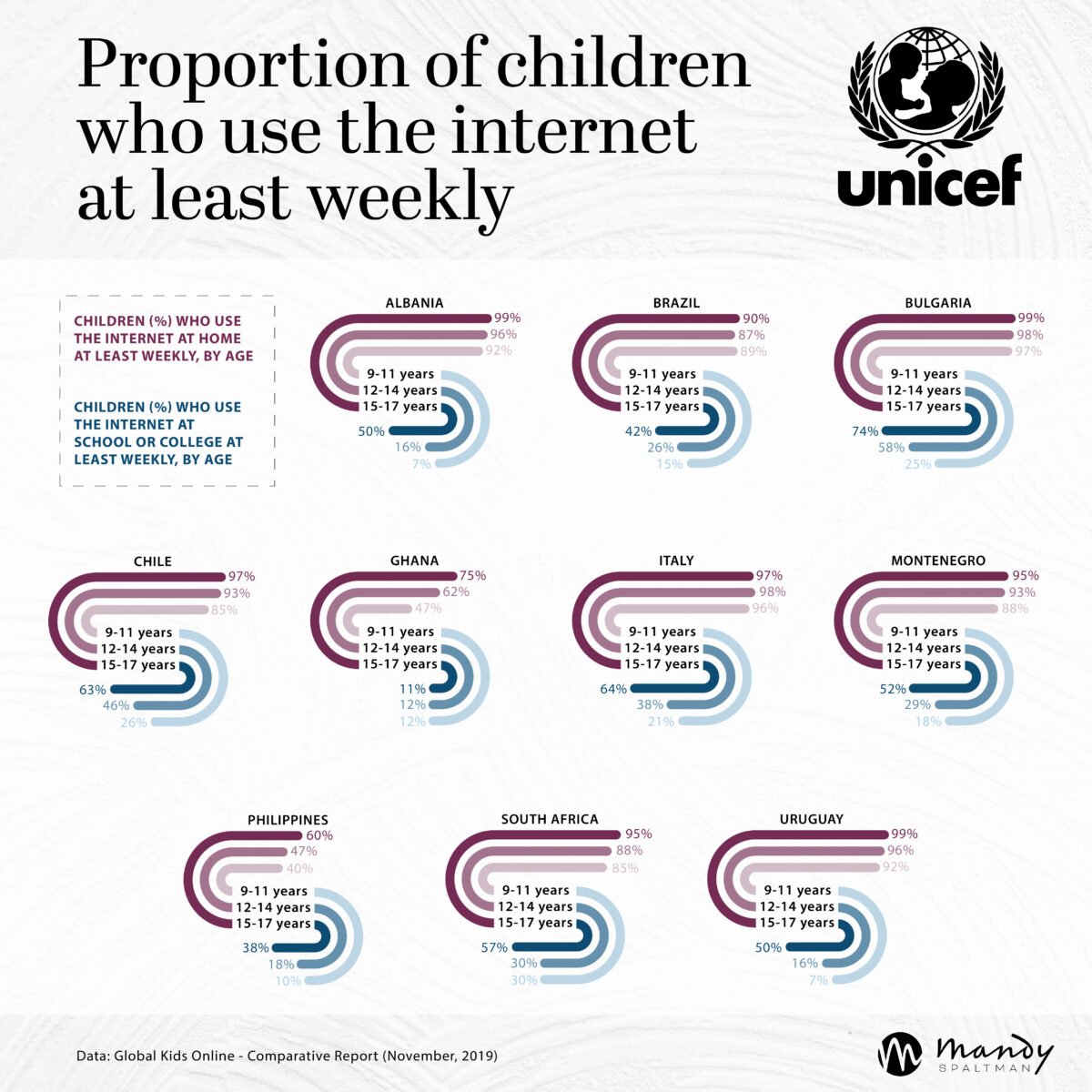
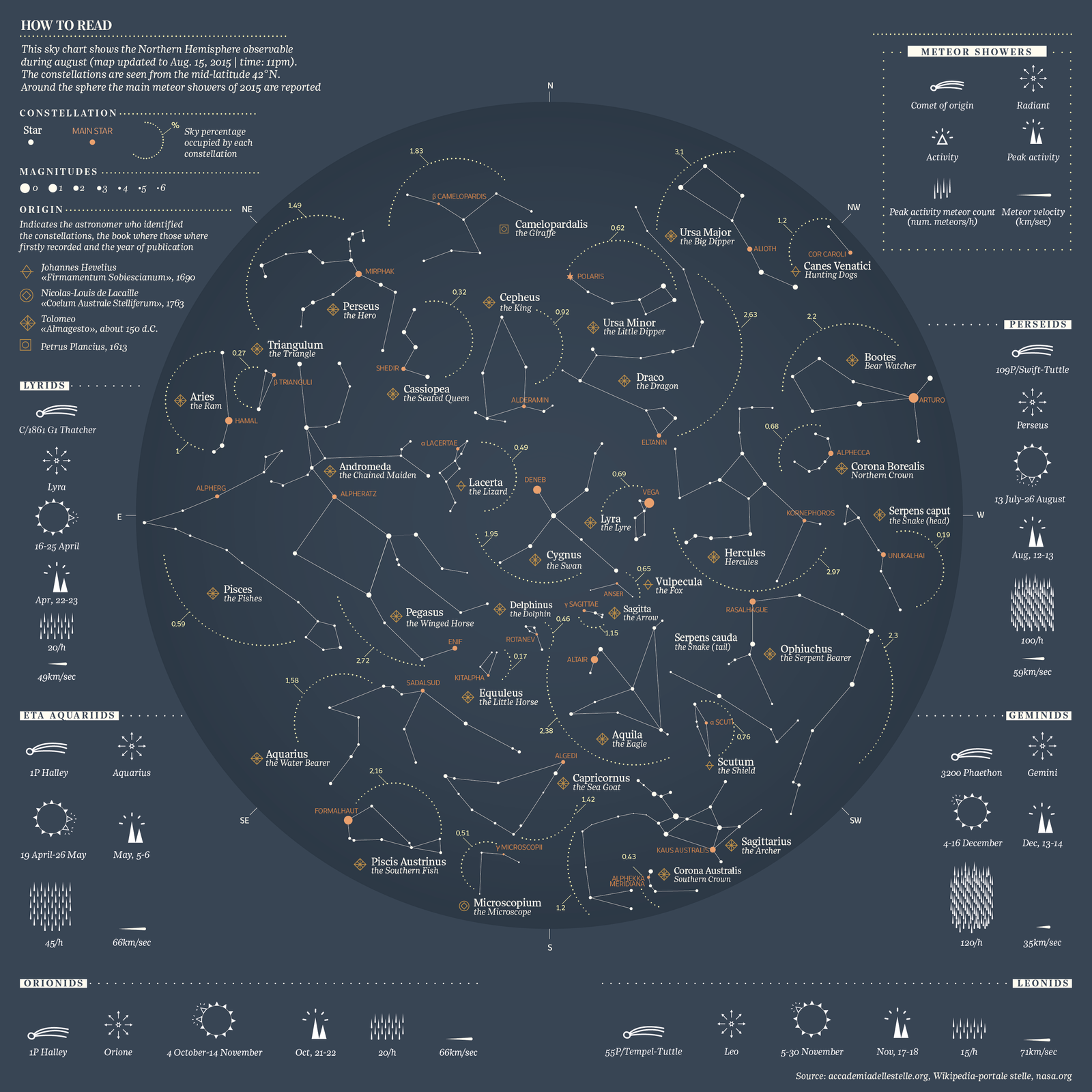
This infographic was made by @mandy.dataviz upon the topic of internet usage by young population
Author: Alejandro J Muñoz
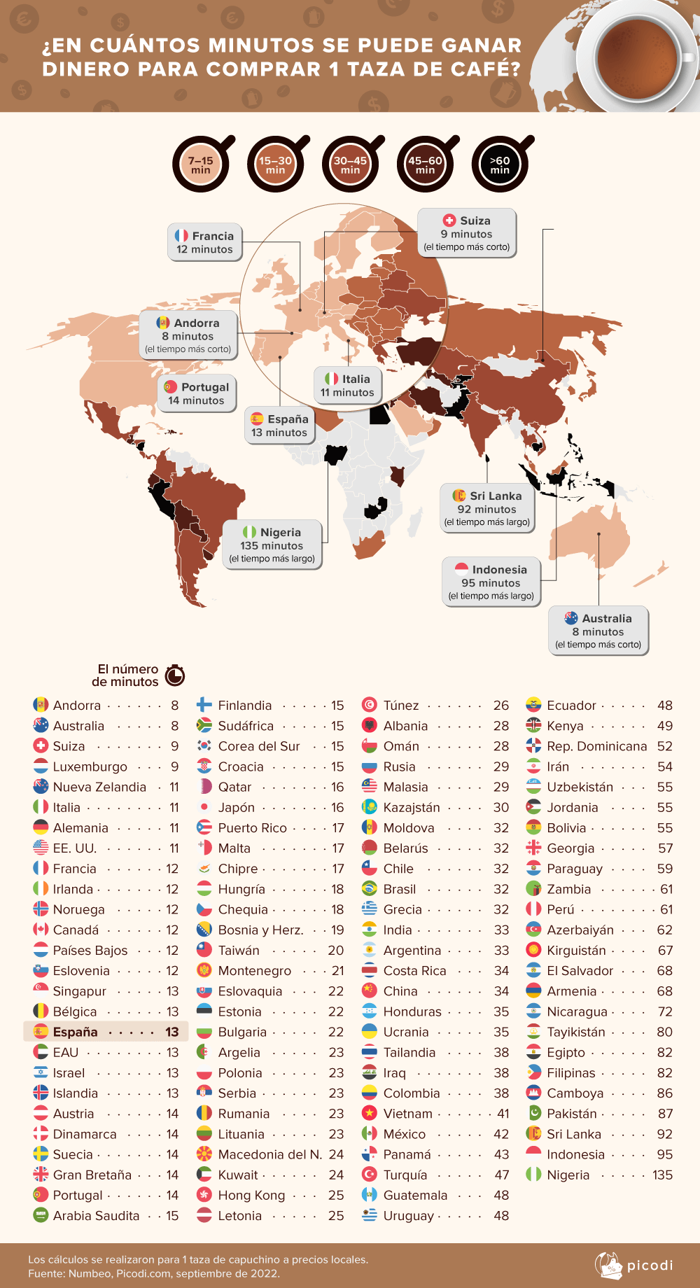
How much (time) is a coffee?
This data is taken from the average price of a cappuccino, collected on the numbeo.com platform, (which has analyzed the price of cappuccino in more than 100 countries in the world) and through the average salary of each country we have been able to obtain a time average, that a person has to work to be able to buy a cup of coffee.
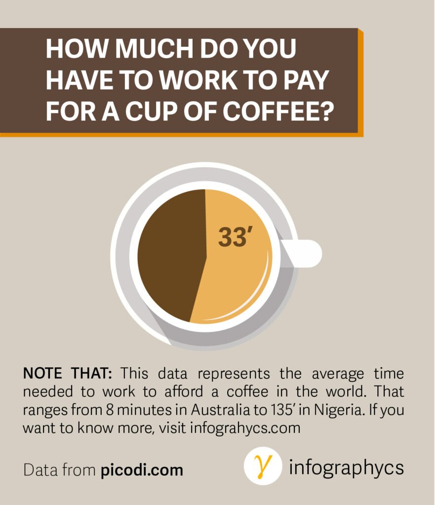
Data based on numbeo
After Picoli: “The working time needed to buy a cup of coffee was calculated based on the average wages we collected from the websites of local statistical offices, ministries or other institutions. The amounts are correct at the time of publishing this post. We calculate net amounts using local gross-net salary calculators. We divide the monthly salary by 21 (average number of work days in a month), then by 8 (average number of work hours in a day), and then by 60 (number of minutes in an hour). In countries where statistical offices use weekly rates, we divide the appropriate amount by 5 in the first step.”
“For currency conversion, we use average rates from September 1 to September 23, 2022 based on data from Google Finance.”
Among the countries included in this study, the inhabitants of Denmark (€5.08), Hong Kong (€5.06) and Qatar (€5.05) pay the most for coffee. On the other hand, Algeria (€0.58), Tunisia (€0.70) and Ukraine (€1.07) have the lowest prices for a cup of cappuccino. However, if we compare coffee prices with local earnings, the inhabitants of Andorra, Australia and Switzerland can boast of the most favorable wage-price ratio: in these countries you can earn enough money to buy a cup of coffee in 8– 9 minutes.
In Spain, the average price of a cup of cappuccino is €1.71, which corresponds to 13 minutes of work for a Spaniard who earns the local average wage (17th place). Less time is needed by residents of Italy (11 min), Germany (11 min), and France (12 min), but more minutes are needed in Portugal (14 min), Romania (23 min), and Greece (32 min).
Sri Lanka, Indonesia and Nigeria occupied the last places in this ranking. In Nigeria, you have to work more than 2 hours to be able to buy a cup of cappuccino, in Indonesia, 1 hour and 35 minutes, and in Sri Lanka, just over 1.5 hours.
Source: https://www.picodi.com/es/top-chollos/precio-de-cafe-en-el-mundo
How many things did I do during lockdown
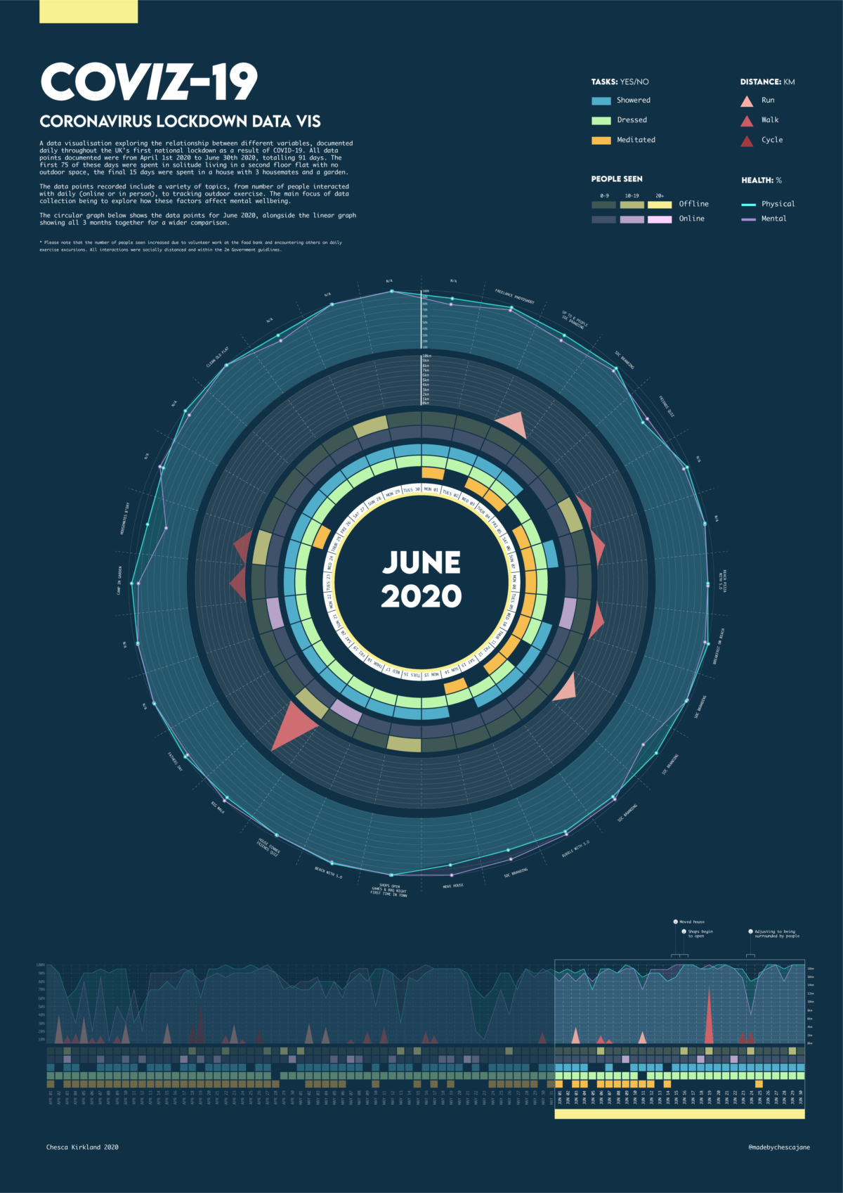
Chesca Kirkland recorded her life during lockdown, things about her daily activities such as how many showers she took, whether or not she meditated or how many people she meet. After that she created this series of infographics to represent those activities in a visual and more inmediate form. It is amazing how data visualization can give us another perspective into our lives, maybe more precise and empirical than our working memory, which usually tends to forget recent events.
You can check out her full story here


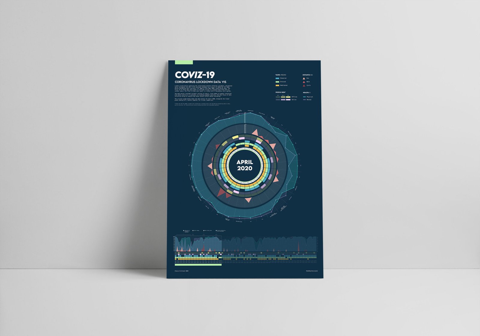
Infographics Data Viz lockdown 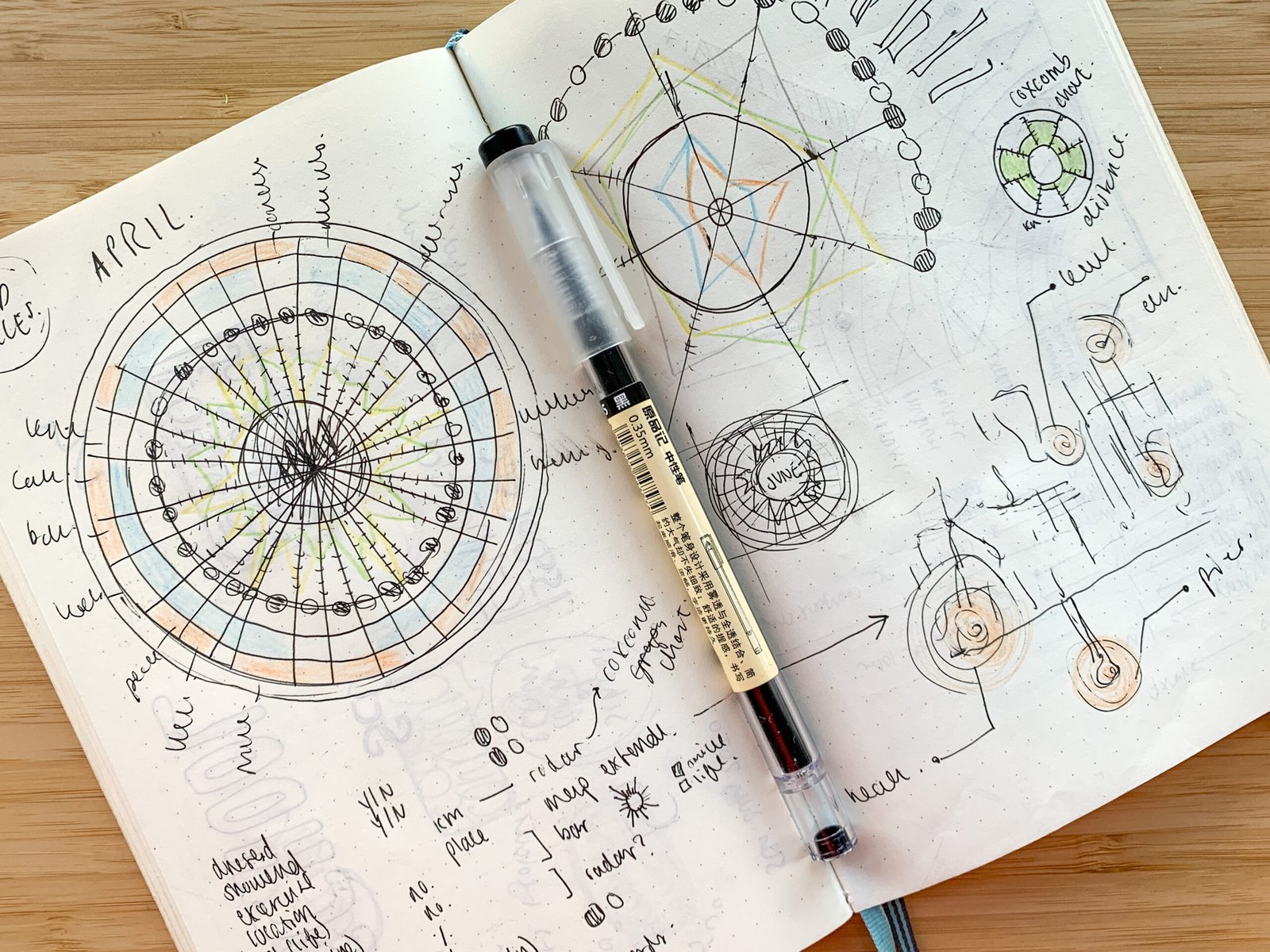
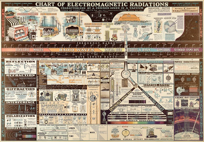
Chart of electromagnetic Radiations
Great visualisation about the electromagnetic spectrum made in 1944 by Dwight Barr and edited by Arthur Compton for the Welch Scientific Company, called: “Chart of Electromagnetic Radiations” It took him years of work to develop this chart
It was found in an abandoned office and now it is in the Laurence Livermore National Institute Laboratory, EEUU
Download full size here
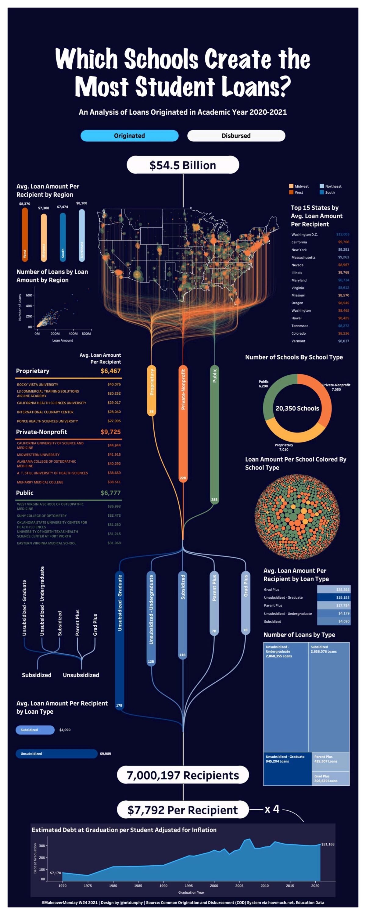
Which US universities create the most loans?
How old are New yorks buildings?
Check out this amazing infographic made by George Koursaros where you can see the density and age of most of New York city buildings.
Isn’t it amazing?
Check it out and interact with it on his Tableau page
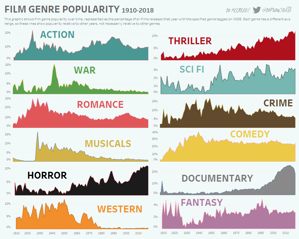
Film genres popularity
Have you been watching more of one genre film lately?
Back in 2019 Bo McCready designed this infographic of the film genres popularity from 1910 to 2018 with the percentage of films released and the specific genre with data from IMDB.
Check out the interactive version down here!
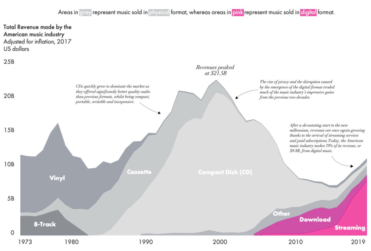
Streaming music in the digital age
Have you noticed the switch from physical vinyl records to digital streaming?
Las year the music industry generated $5.9 billion in revenue from music streaming services like Spotify and Apple Music. Great work By Alexander Vassilev
Fractions, explained
Have you ever struggled understanding fractions, we have all been through that. Here is a great illustration made infographic by Grand Snider, hope it heps!
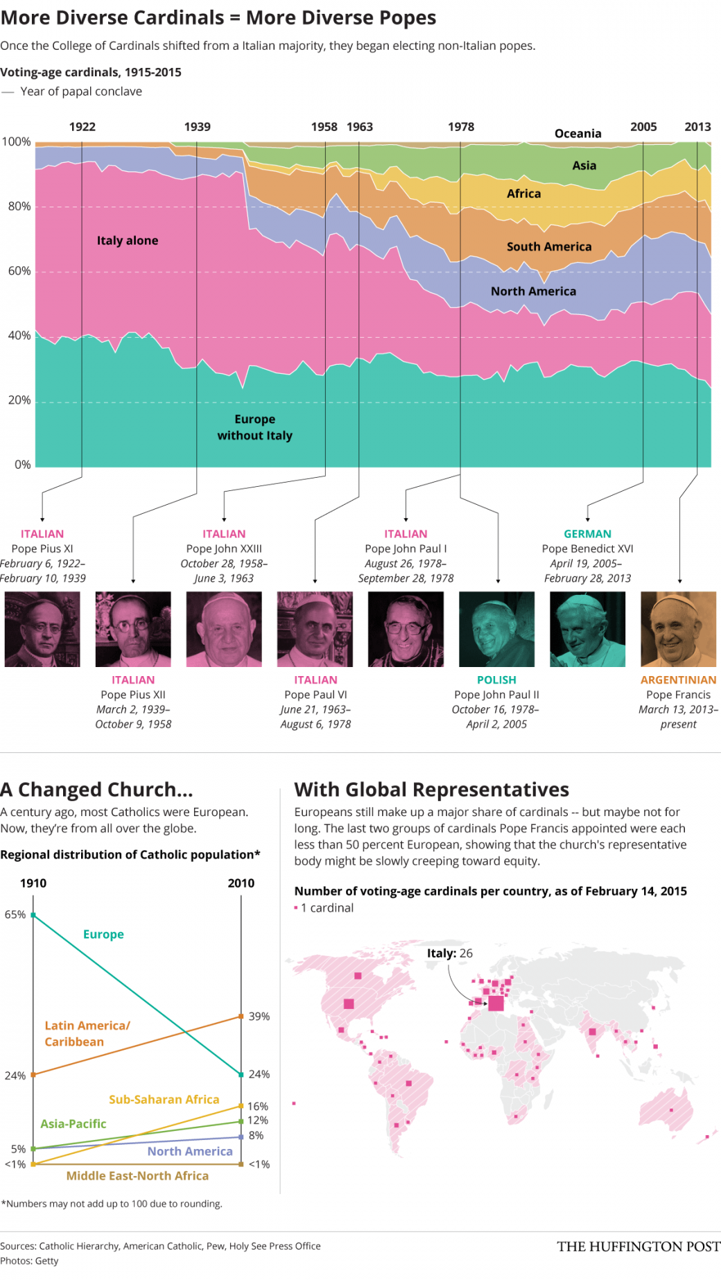
Variety in Christianity
About the diverse world of Cardinals and Popes around the world
by Alissa Scheller
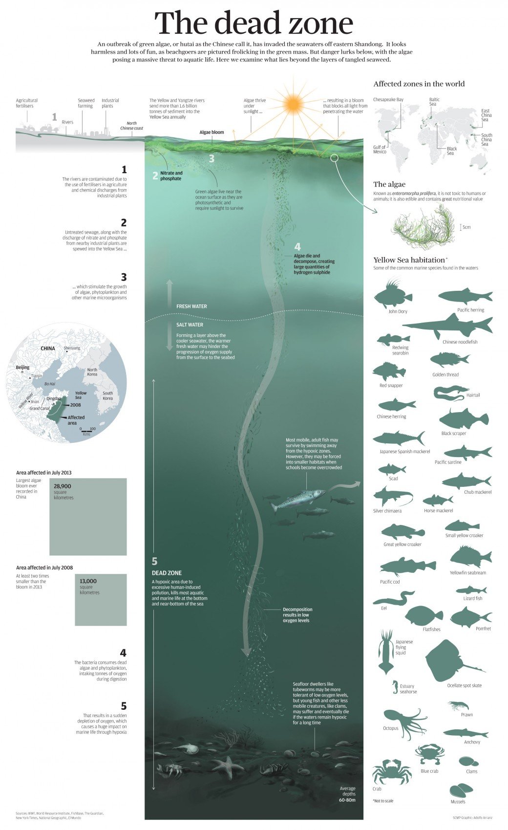
The dead Sandong
The sea has been infected by algae by Adolfo Arranz
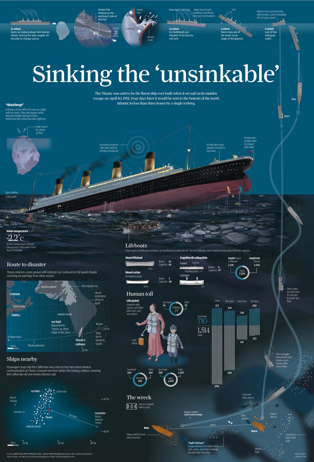
How to blow up the Titanic
Impecable work by Adolfo Arranz
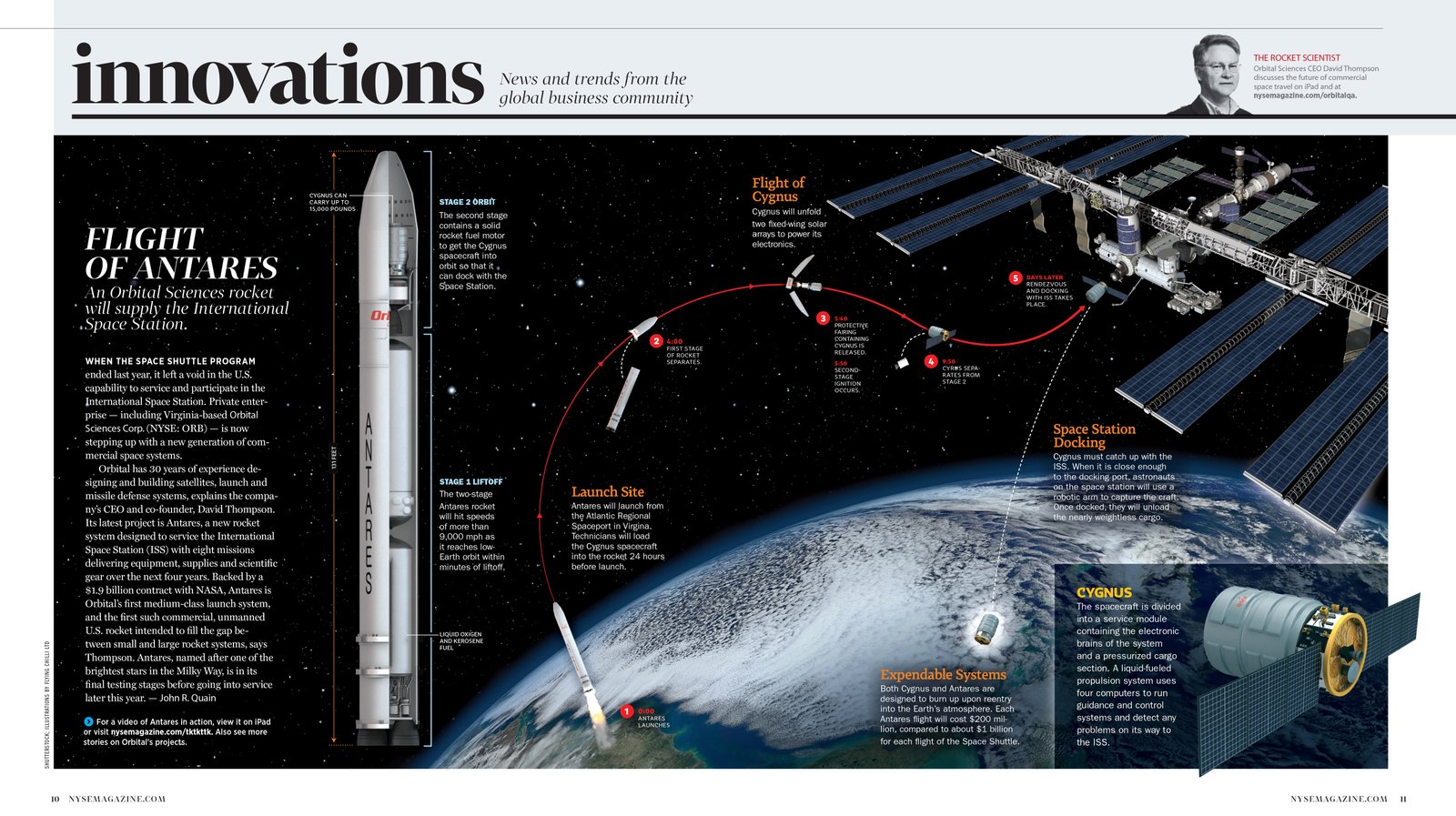
Flight of Antares
Amazing infographic work by 5W Graphics
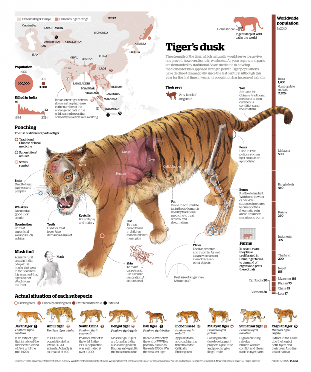
The Tiger’s dusk
Dive into the anatony of the tiger with this amazing infograpic by Adolfo Arranz
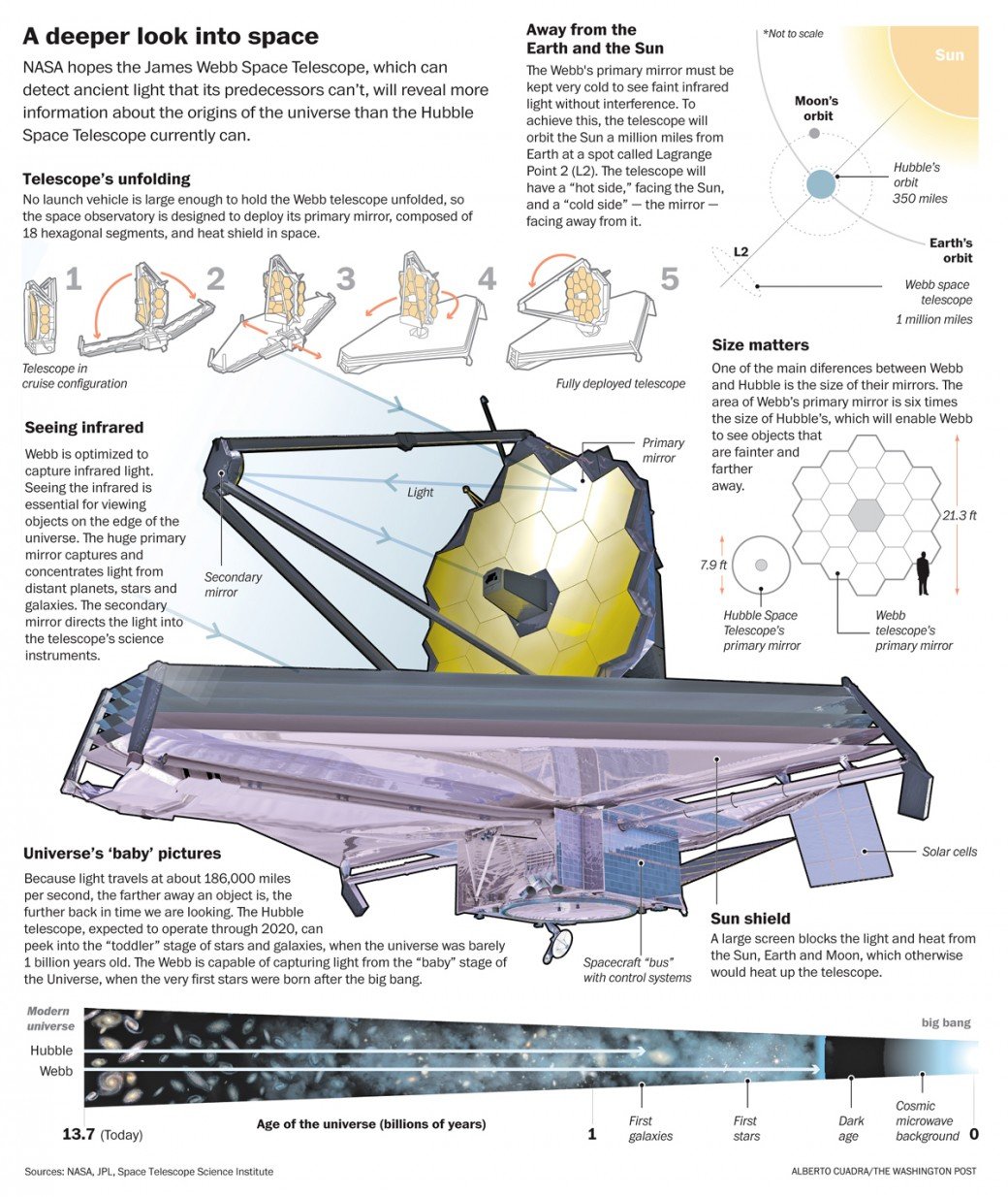
About telescopes
Great infographics by Alberto Cuadra
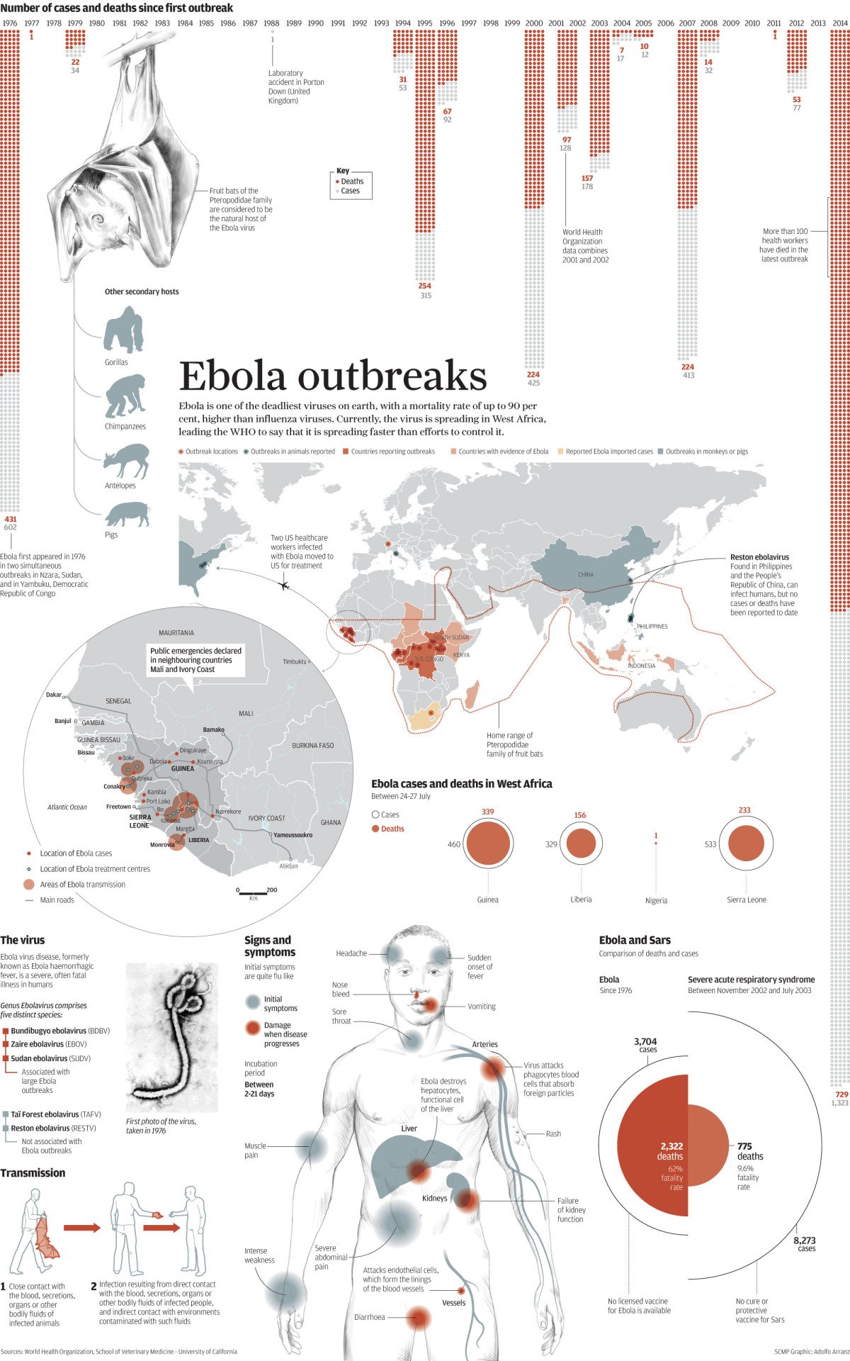
The pest of the ebola
The ebola spread and Afolfo Arranz does a great infographic about it.
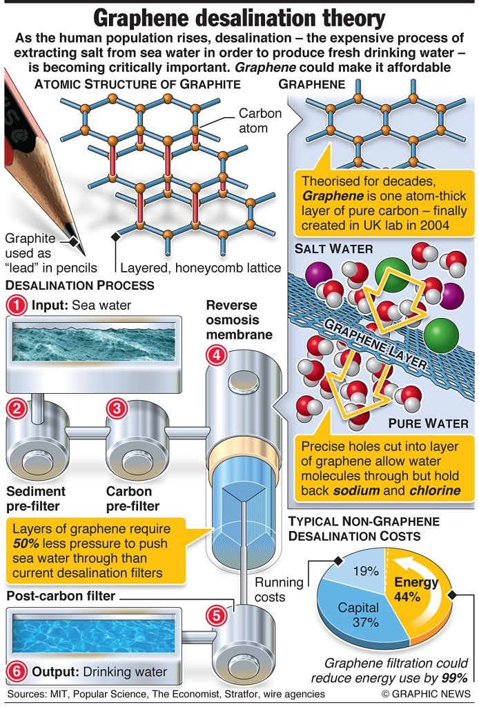
How to make water desalination cheaper?
Infographics are a great way to explain complex processes in an easy way. Here is another example of a great infographic made by graphic news in which they explain how graphene could improve the water desalination process and make it more affordable for all?
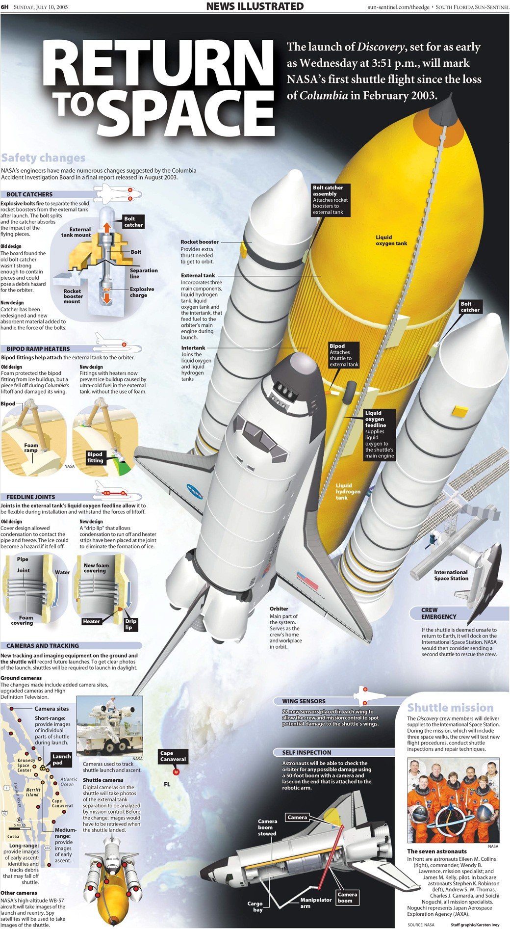
Back to space
The infographic that depicts the improvements of flight to space by Karsten Ivey
The dark sky!
Magazines get infected too
The #COVID19 has also infected the magazines front page. Javier Errea (Errea Comunicación) is making a beautiful visual diary of the effects of the quarantine. And one of them is about how the VIRUS it has changed the front page color pallet of the Magazines in the country of Spain. I encourage you to do the same in your countries. Follow up his great work in his blog: www.cuarentenavisual.com
